Design
Perfect is starting to look the same.
On day three of my sabbatical, I made my own typeface.
Which is a pretty nerdy thing to be excited about. But here we are.
Making my own typeface has been on my bucket list for years.
So has writing and illustrating a children’s book.
And now that I’m finally focusing on the latter, I figured maybe it was time to kill two birds with one stone.
But there was another reason.
I’d been designing the pages of my children’s book and trying to find the right typeface.
I tested over 25 different fonts.
Twenty-five!
Some were basic. Some were sterile. Some were playful. Some were charming. Some looked handwritten. Others were beautifully designed.
They were all good typefaces. Legible, with carefully considered kerning and spacing.
But none of them felt right.
I couldn’t quite explain what was missing.
So I decided to make my own.
I grabbed a black pen and started writing.
Uppercase letters. Lowercase letters. Numbers. Punctuation.
Every letter. Every symbol.
Three times.
I took photos of my pages, asked ChatGPT to help clean up the images, and turned my handwriting into an actual font using Calligraphr.
And when I finally used it in my book, something clicked.
It was perfect.
Which was funny, because technically, my typeface was anything but.
The letters weren’t always the same height. The strokes weren’t consistent. Some sat a little crooked on the baseline. The ascenders and descenders seemed to have minds of their own.
But the paragraphs, the pages, the book felt more real.
More personal.
Like it had a little more soul.
Not because my typeface was better than the other twenty-five.
But because it was mine.
And it made me wonder.
In a world where we can make almost anything look good, what makes something feel human?
When everything looks good, everything starts to look the same.
I’ve been thinking about this a lot lately, especially with AI.
We’re living in a time when almost anyone can generate a beautiful image, write a polished paragraph, or design a professional-looking poster in seconds.
And that’s pretty incredible.
But I’ve also started noticing something.
A lot of it looks the same.
The same illustrations.
The same compositions.
The same visual styles.
The same writing that sounds thoughtful but somehow says very little.
Even at my kids’ school, I’ve noticed more AI-generated posters, announcements, and classroom graphics.
They’re colorful. They’re cheerful. They’re well put together.
And yet, something feels missing.
I can’t help but think about the handmade posters I grew up seeing in classrooms.
The uneven letters cut from construction paper.
The hand-drawn illustrations.
The slightly crooked borders.
Or even the signs at Trader Joe’s, where artists are still hand-lettering product names and prices in 2026.
You can see the person behind them.
You can see that someone spent time making them.
And I get it. Teachers are busy. Parents are busy. We’re all busy and looking for ways to do more with less.
AI makes it possible to create things we might not otherwise have the time, skills, or resources to make.
That’s a wonderful thing.
But I wonder if, in making everything easier to create, we’re also making everything easier to forget.
Because when everyone has access to the same tools and shortcuts, something starts to disappear.
Not necessarily the handmade part.
But the human part.
And I think that’s what I was searching for when I tried those twenty-five typefaces.
They weren’t bad. They just didn’t feel like me.
The funny thing is, AI can imitate imperfection, too. It can make something look hand-drawn, handmade, or a little rough around the edges.
But that’s not quite the same as making something personal.
Maybe the goal isn’t to make things less perfect. It’s to make them more our own.
Five ways to make your AI creations feel more human.
1. Start with something only you know.
AI knows a lot about the world. But it doesn’t know your experiences, memories, or the little things you’ve noticed that nobody else has.
Before prompting, bring your own stories, sketches, photographs, or observations into the process.
The more of yourself you put into the beginning, the more of yourself you’ll recognize in the end.
2. Don’t polish away all the personality.
AI is great at making things sound professional. Sometimes a little too professional.
I’ve asked AI to refine my writing, only to realize I liked my original version better. Minus the grammar mistakes, of course.
Sometimes the strange phrase is the good phrase. The sentence that breaks the rules is the one people remember.
Polish for clarity. Not conformity.
3. Make something with your hands.
Sketch before you prompt. Write before you rewrite. Take your own photographs.
Funny enough, when I first asked ChatGPT to turn my handwriting into a typeface, it gave me something that looked like an existing font.
Talk about conformity.
I called it out and got the familiar response: “You’re right.”
But I didn’t want something that looked like my handwriting. I wanted my actual handwriting.
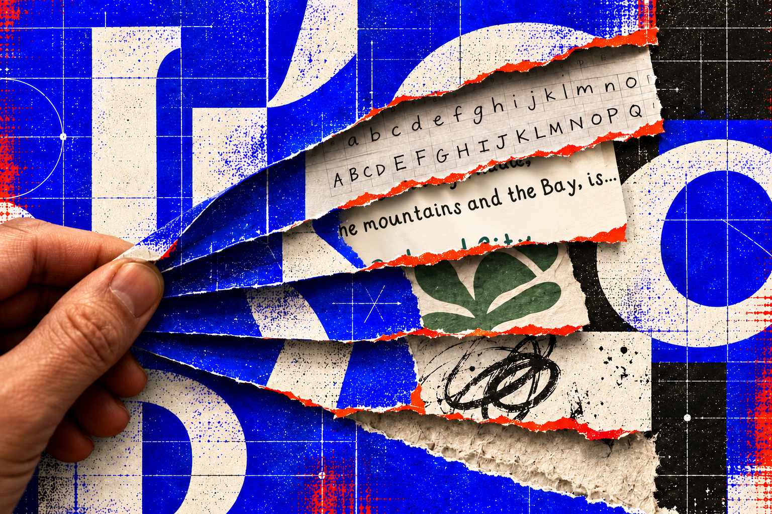
Not everything needs to start with a prompt.
4. Have an opinion. And be a little weird.
AI tends to gravitate toward what’s familiar. But interesting creative work often comes from unexpected choices.
Don’t just ask AI to make something beautiful. Tell it what you find beautiful. What you dislike. What feels too obvious.
And don’t be afraid to reject something that looks good but doesn’t feel right.
Sometimes what we’re looking for isn’t more options. It’s more of ourselves.
5. Know when to stop refining.
With AI, there’s always another prompt. Another iteration. Another version.
But more iterations don’t always lead to better work.
I could spend days correcting every uneven letter in my typeface. But at some point, I’d risk losing the very thing I liked about it.
Sometimes knowing what to leave alone is just as important as knowing what to improve.
Leave a little of yourself in it.
I started making a typeface because I couldn’t find the right font for my children’s book.
I ended up with a reminder of why I love making things.
AI makes it easier than ever to create something that looks good. But looking good and feeling human aren’t necessarily the same thing.
Maybe that’s what I was missing in those twenty-five typefaces.
Not better typography.
Just a little more of me.
Because the goal isn’t to make something perfect. It’s to make something yours.
A little bit of my handwriting, for you.
If you’d like to use my typeface in something you’re creating, I’ve made it available to download for free.
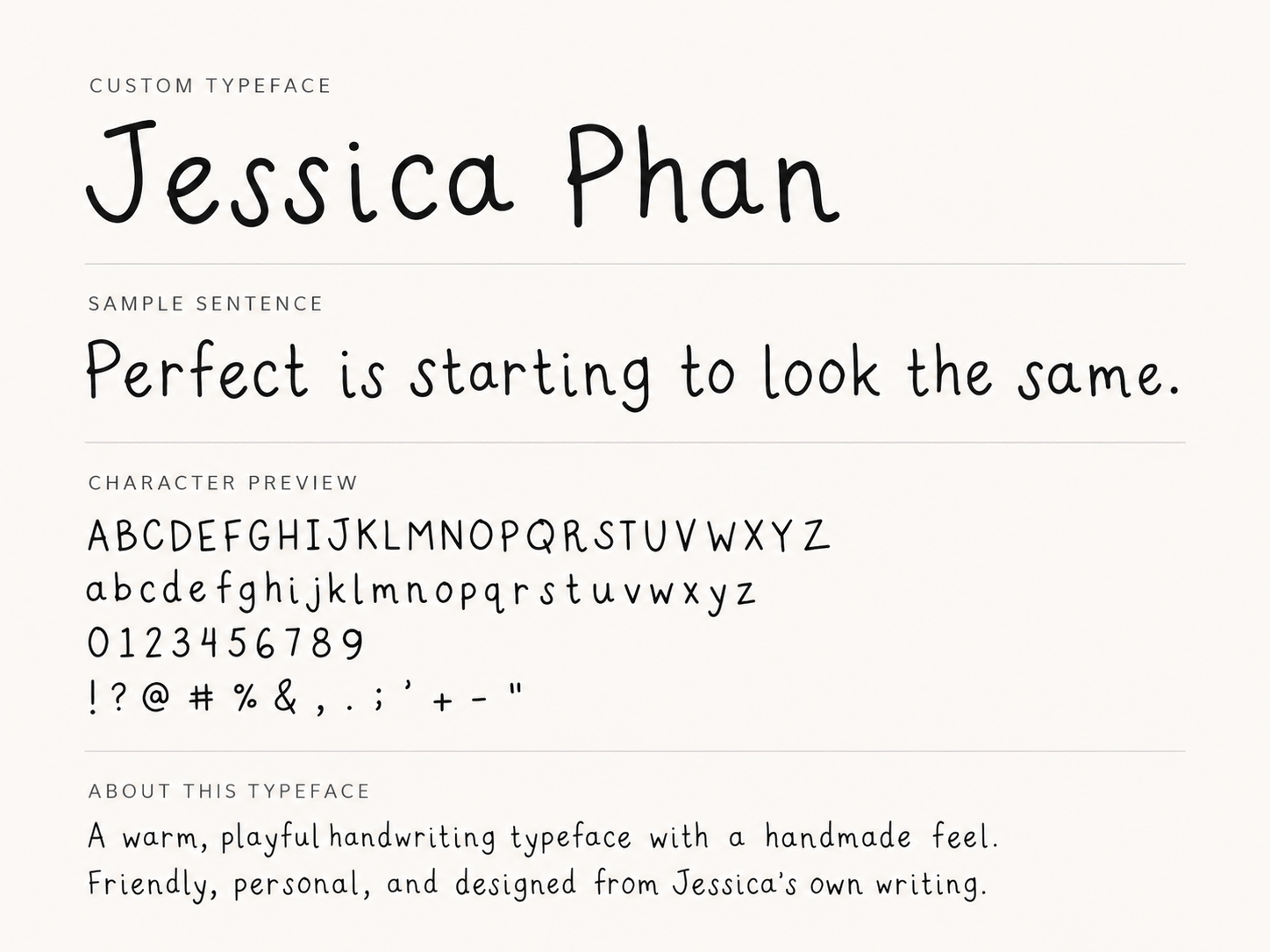
It’s a little crooked, a little imperfect, and full of character.
Download my typeface